ICON
Nordstrom ICON: Single view of a customer
Overview
Before 2018, Nordstrom maintained customer data in separate silos, which resulted in customers being asked to provide the same information multiple times throughout their journey. Previous attempts to merge this information into a single customer record were limited due to difficulties in accurately merging customer information across multiple systems. ICON was created as an aggregated, consistent, and holistic representation of all data known about a customer that can be viewed in one place.
Results
At the end of 2019, over 6 million nordstrom.com customers now have completed ICON records. Customers who complete their ICON record unlock new experiences and get better product recommendations across Nordstrom and its subsidiaries. The core ICON work required UX coordination with over a dozen teams across four companies.
Roles
User Experience, User Interface, Visual Design, Production
The Nordstrom Board of Directors declared in November 2017, that protecting customer data is a part of good customer service, and we were tasked to increase our online security by the end of Q1 2018.
Working backwards from March 2018, we needed to give technology ample time to develop and test, so UX needed to be done with our work by the end of January. The Principle UX Designer started research on industry best practices, our UX Writer started research on copy best practices, while I dove into a competitive analysis.


Based on our combined research, the UX team presented 16 points that we felt best represented industry best practices and a customer focused experience.


Next, I partnered closely with product management, technology, and security to create user flows that mapped out the experience of signing in and checking out. The user flows helped us identify any pain points, gaps, or technical limitations that we as a team might need to work around.


I quickly created a set of MVP comps and a second set of phase two comps as a fast follow.
An interesting element of the MFA project was that UX was working directly with teams that from an experience standpoint, are diametrically opposed. The primary goal of Security is to protect the company from bad actors, by making it harder for them to access sensitive information. This is inherently added (and arguably necessary) friction for users.
In my original design, I created a code input field that helped customers understand how many digits to expect in the code that we would send them, along with displaying the numeric keypad for mobile users. Security argued that having individual fields limited their ability to modify the code length in the event of a large scale, orchestrated attack. Additionally, they requested the standard keyboard, which would make it harder for bad actors to determine how codes are formed.
After a very passionate and heated debate between teams, UX understood the need for security to be flexible with code length and agreed to move to an open form field. UX pushed back hard on the standard keyboard, arguing that forcing customers to try an enter a numeric code from the standard keyboard would be an exercise in frustration, given the limited time the text message appears on a customer’s screen.
After working closely with security, privacy, and legal, the design was iterated until we got to a point that met each team’s requirements. I began to build out a prototype for our sole usability test.

A couple of weeks before the launch, the user research team conducted a remote study with 20 participants. All of the participants were able to complete the task and 18 participants felt the process was intuitive. The primary learning from our usability study was that we could make some additional improvements with the copy to make the process clearer.


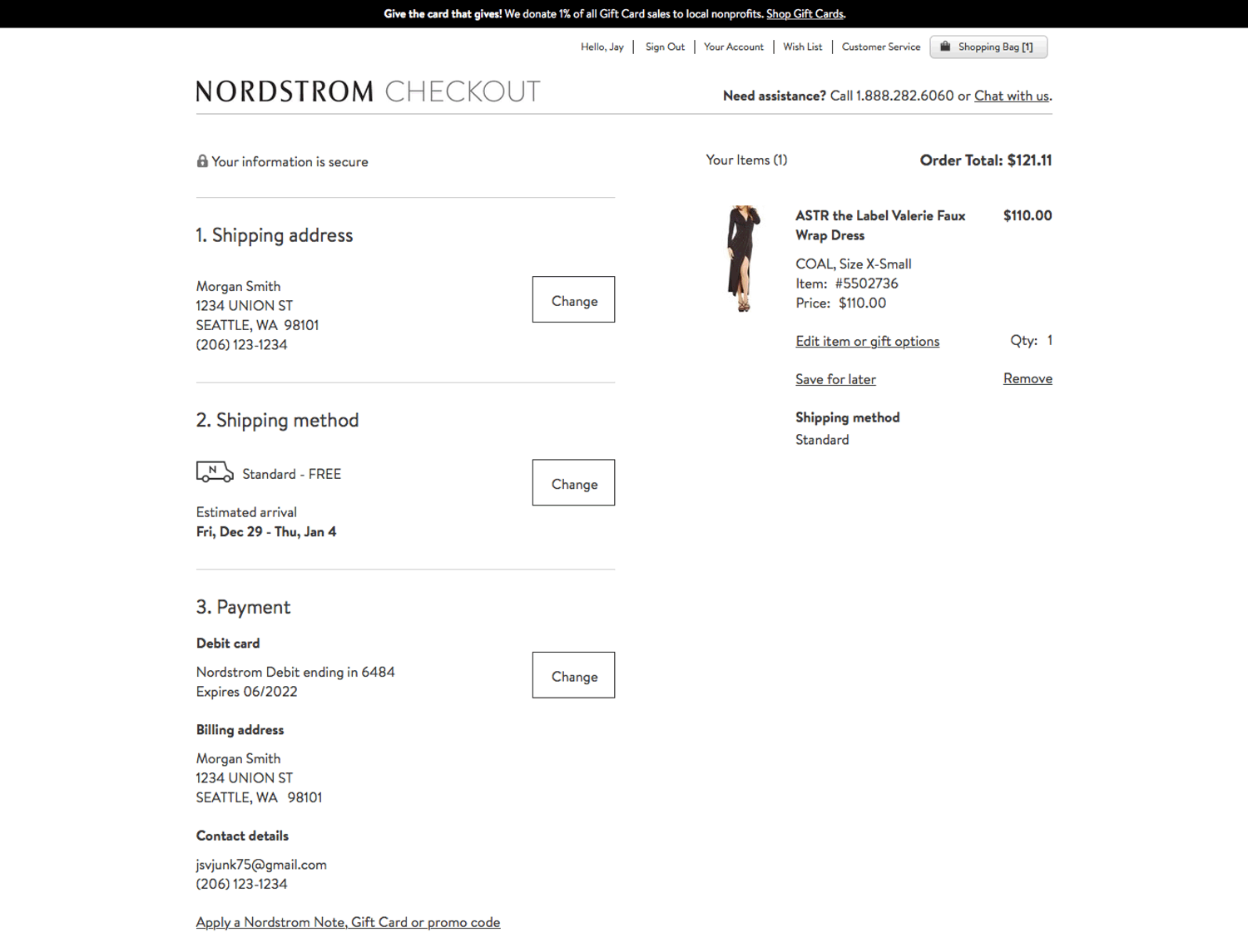
The final desktop checkout flow.


The final MOW checkout flow.


The final iOS checkout flow.


The final Android checkout flow.